For businesses ‘data is the key to success; as the world evolves every minute, data is becoming more and more precious. Organizations like Google have built multi-billion dollar businesses by leveraging the power of data.
According to Forbes, 2.5 quintillion bytes of data are created every single day.
Any data analyst knows that data visualization is just as important as data collection and processing. Data visualization is the representation of data in a visual format. It can be in the form of a graph, a chart, a map, or any other visual format.
Creating loads and loads of spreadsheets, presentations, graphs, and charts is any data analyst’s nightmare. It is very time-consuming and requires a lot of effort.
Spending a lot of time creating data visualizations can shift the focus from data analysis and interpretation to data presentation.
If you are facing a similar problem, Google Data Studio is the way forward.
Explaining What’s Google Data Studio
Google Data Studio, also known as GDS, is a data visualization tool. It was introduced as a part of Google Analytics 360. Google launched a free version of GDS in 2016, and this free version was for individuals and small businesses.
A paid version of GDS was also introduced for bigger organizations; the paid version contained many premium features that were not made available on the free version.
In 2017, Google made GDS free for all users, and it has been evolving since, with new features being added every year.

Why choose Google Data Studio
There are a lot of data visualization tools, so why should you choose Google Data Studio?
Because it is Free and Beginner friendly, most of its features are easy to understand and use. You can share data very easily through GDS.
It lets you build immersive dashboards and eye-catching reports.
You can also schedule reports for when they are required. Google Data Studio also stores all of this data so you can track your performance over time. For example, marketing departments can track customer Key Performance Indicators or KPIs with GDS.
Important features of Google Data studio
Google Data Studio packs in some immensely useful features
- Two hundred twenty devices can have a live connection and access to data at a time.
- Data visuals are fully customizable.
- Multiple pages and charts can be added to a single report.
- You can apply many advanced formulas to generate better results.
- Filters can be applied to data to generate relevant results.
Currently, the global data visualization market is worth $2.99 billion. However, it is expected to reach $5.17 billion by the year 2026.
If you are not using a data visualization tool, you might spend a lot of extra time creating each graph or chart manually. So to save your time for more important tasks, here is a guide for you to get started on Google Data Studio.
Getting started
Logging in
You can log in to Google Data Studio by logging on to https://datastudio.google.com/
Click on the sign-in option and sign in with your Google account. Once you’ve signed in, Google data studio’s dashboard will open on your home screen.
Now you are ready to start creating your first report
Creating report
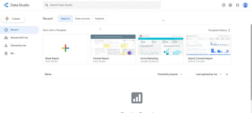
To create a report, click on the Blank Report option, you’ll be asked to enter your country and your company’s name.

Fill in all the relative information in the form and click on continue.
An untitled report page will open; all your data, including your visuals and text, will be stored here.

Now Is the time to select a data source.
Selecting Data source
Click on the Add data option from the toolbar
Two options will be provided to you.
“Connect to data” and “My data sources.”
Select any sample data from” My data sources.”
Once you have selected your data source now, you can select the visuals for it.
Creating visuals
Click on the “Add a chart” option from the toolbar, and a drop-down menu will appear.

A Pane will appear on the right side for you to adjust the dimensions.
Select an option from the “Add a chart” drop-down menu.
The chart you’ve chosen will appear on the screen.

Customization
Once the chart appears on the screen, it can be fully customized as per your choice.
Select the “Style” option from the right-hand pane, and a lot of options will appear, so you can fully customize the visual.

Text addition
For adding text, click on the “Text box” icon in the toolbar, and you can select the place where you want to add your text box.
Enter text in the text box and highlight the text you have entered. You can customize this highlighted text from the style option.

Once you are satisfied with how your report looks, download it. There is also an option to share it.
Downloading report
Select the “File” option from the top right corner and click on “Download as” select pdf, and your report will be downloaded as a pdf file.
You can also share your file by using the “Share” option from “file.”
Now you’ve gone through all the steps of creating a report.
Let’s look at some of the features of Google Data studio in detail
Report Templates
You can always start with a Blank report, but there is a wealth of report templates in Google data studio.
These templates can be really helpful if you are short on time. You can select a template and start adding your data to it.
You can also use these templates for generating ideas for your report and combine these ideas to create a mesmerizing report.

You can add any amount of pages to these templates. You can also use these templates to maintain consistency within your reports.
Data sources
Google data studio has a number of data sources to help you import data easily and effectively. These include
- YouTube Analytics
- Search ads 360
- Tables by area 120
- PostgreSQL
- MySQL
- Google surveys
- CloudSQL for MySQL
- Campaign Manager 360
- BigQuery
- Cloud Spanner
These are some of the popular ones, and there are many other options for you to choose from.
Embedding Content
External content such as YouTube videos can be easily embedded in your report. You don’t have to own all the content that you are using in a report.
Just press insert and select the URL embed option. Next, copy the URL of the video, spreadsheet, or document you want to embed in your report.
Enter this URL in your report through the URL embed option, and the embedded content will appear on your report.
You can adjust the size of this content according to your preference.
Scheduling Reports
If you are reluctant to share live reports with your customers or shareholders, you can always schedule reports to be delivered later to them.
You can even schedule reports to be sent daily to your customers or colleagues.
Follow the steps given below to schedule an email report
Select “share” and click on “Schedule email delivery.”

Enter the email addresses of the recipients. Your email address will be added by default.
Enter the date and time for starting this process.
You can also share reports on a daily, weekly, and monthly basis.
If the given options in “Repeat” are less than ideal for you, you can always customize the frequency for sharing reports.
Bottom Line
Getting started on anything new can be a bit intimidating at first. But, it is all about making that one bold move.
People who prepare reports manually may have some skepticism towards tools like Google data studio. But once you get started. There is no going back. The valuable time and resources you save from automated report creation and sharing can be used to solve more important issues.
What other data transformation tools do you like or use?